MoodMix is a prototype visualization tool exploring using interactive fluid dynamics techniques to represent electrodermal activity (EDA) and vocal F0/fundamental frequency time series data. The user experience goal is on qualitative understanding, playfulness, and pre-attentive visualization aesthetics as opposed to traditional specialist-oriented data visualization. EDA and voice affect data are correlates of physiological activation used in fields such as affective computing. For example, increases in EDA occur when one is experiencing stress. Similarly, changes in vocal frequencies can correlate with changes in emotion.
The visualization loads this physiological data from a physiological sensing device such as a health smartwatch. Different ranges of EDA physiological activation levels map to differently colored translucent circles. The diameter of the circles map to F0 frequency rate of change. These circles or droplets of data points fall under simulated gravity into the app window, accumulating layer by layer.
The bottom droplets represent the earliest data while higher layers represent more recent data. The user can control the gravity vector arrow (centered on screen) to slosh around the droplets of physiological intensities, mixing them together into a multi-colored pre-attentive view and inviting reflection on moods, affective states, inter-relations, and how they change over time. Visualization settings such as colors, gravity vector toggle, and droplet transparency are adjusted through the parameters panel.
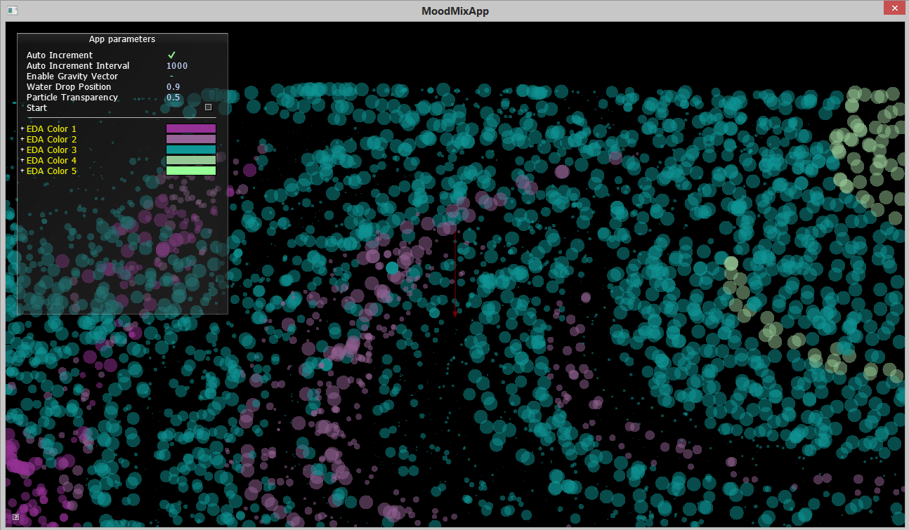
Visualizing the dataset as a fluid simulation with incremental presentation of data enhances visual interest and emphasizes the dynamic quality of the subject matter. The droplets themselves leverage pre-attentive cues such as color contrasts and size. Image 1 shows a predominance of median levels of EDA (turquoise color) and greater F0 rate of change values. We can see that there are clusters of lowest EDA values (the magenta bands) earlier in time and the very highest EDA values (the light green groupings) near the end of dataset.

Image 1: The default view of all of the data dropped into the "tank".

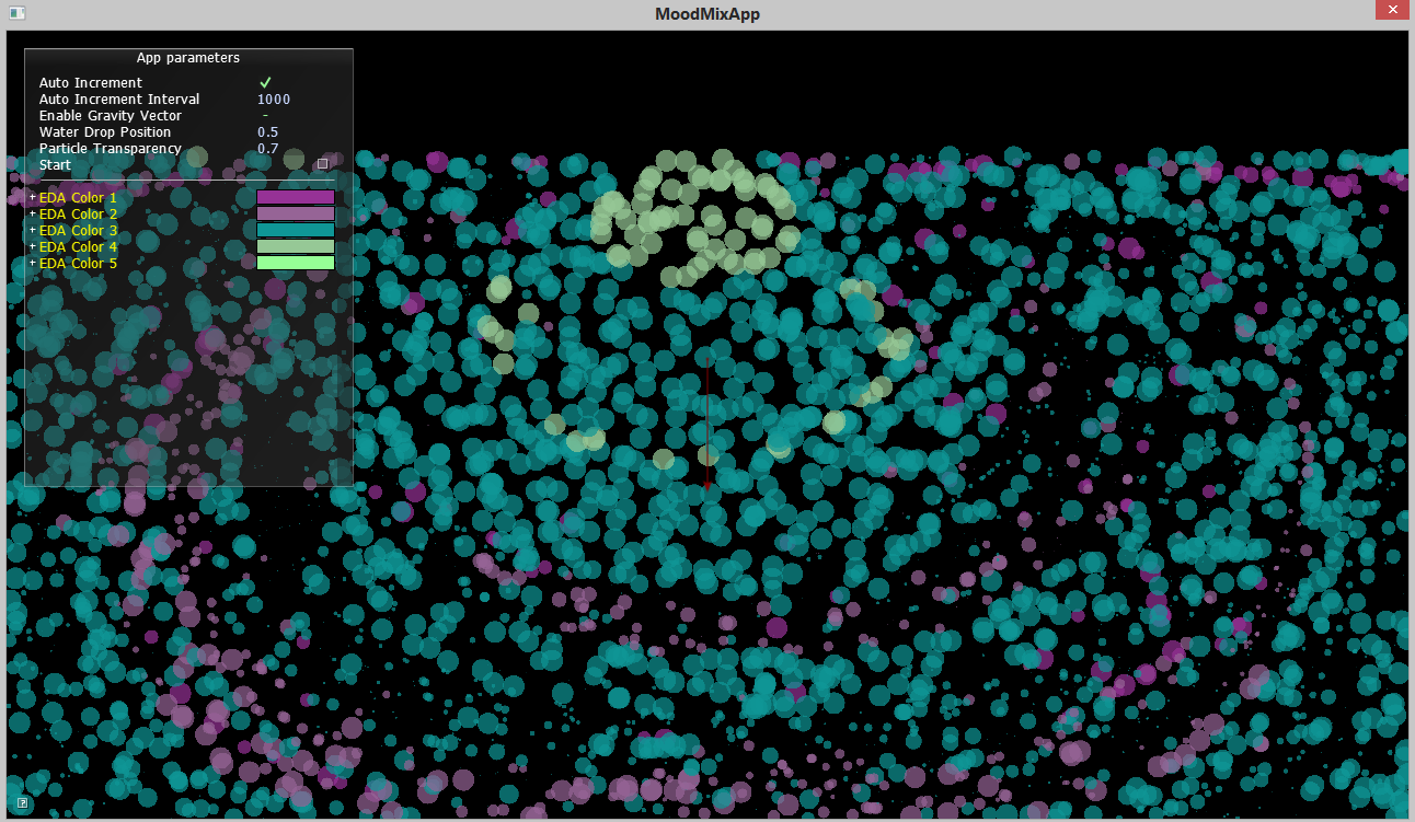
Image 2: MoodMix showing a "tree ring" representation style of the same data as image 1 by centering the initial drop point of the circles.
MoodMix dynamics.
MoodMix with alternate colors mapping to EDA levels using the "app parameters" panel.
© 2022+ Xuan Li.